Role
School
SDU Kolding — 3rd Semester Project
timeline
Members
What problem did we solve?
Current self-service
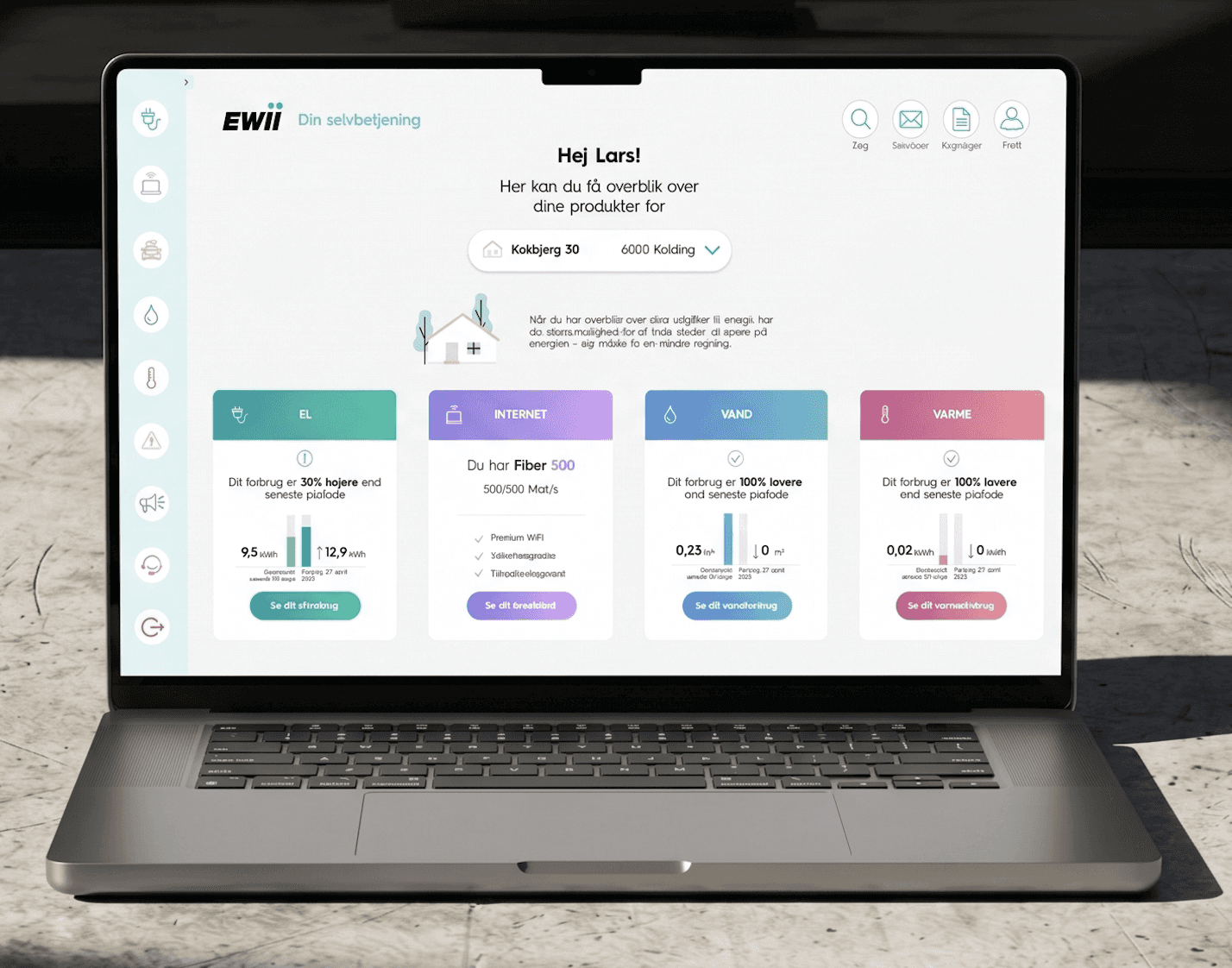
Our self-service
But how did we get there?
We followed the Double Diamond process.
Affinity Mapping & Personas
In the initial phase of the project, the core objective was to gain a deep, data-driven understanding of how users interact with the self-service platform. We took an exploratory approach to identify real challenges in the user journey and examine them.
Affinity Mapping
Utilizing a substantial dataset from a customer panel of 1.248 people from EWII questionnaire, we developed a digital Affinity Diagram. This process allowed us to cluster user "pain points" into themes such as navigation, login, and the visualization of consumption data.
Positive feedback on self service
Uncategorized
Negative feedback on self service
Improvement suggestion
Persona
Before deciding on how to accommodate different user behaviors, we first made sure to understand the motivation within the customer base, so that after having a full overview we could ensure the platform catered to everyone.
We started this by analyzing five established customer personas from EWII's own analysis ranging from highly tech-savvy users who prioritize fast, independent access, to more security-focused segments who rely heavily on clear and accessible communication, then using the collected information as input to ensure our design decisions supported users across all levels of digital literacy.
Under NDA — content protected
Define
How Might We
Design
Problem
Users find it difficult to tell whether they are on the self-service platform or EWII’s website. Because EWII uses its brand colors throughout the self-service platform, the color theory doesn’t hold up, as users don’t get the correct indicator in their consumption.
HMW
How might we make it easier for users to tell the difference between the self-service platform and EWII’s website?
The Insight: The visual continuity between the two platforms caused confusion. Additionally, the lack of conventional color-coding (like red/green for high/low usage) made the interface harder to decode for less tech-savvy users.
Login
Problem
Users find the login process frustrating, as it can only be accessed using MitID.
HMW
How might we ease the login function so users can log into their self-service platform frictionlessly, in whichever way they individually find best?
The Insight: The strict reliance on a single external authentication method (MitID) caused unnecessary friction. Users requested faster, more flexible alternatives without compromising security.
Navigation flow
Problem
Users find it difficult to navigate the self-service platform and find their way to the desired destination.
HMW
How might we simplify the navigation flow so users can more easily reach their goal with fewer clicks or less frustration?
The Insight: The existing structure lacked a clear hierarchy and required too many steps to find basic information, which increased cognitive load and frustration when users simply wanted to locate their bills.
Consumption visualization
Problem
Users feel that the new consumption overview is cluttered and unclear, and that the bars are too small. Users also feel that the colors make it difficult to distinguish between the bars in the consumption overview.
HMW
How might we make the design of the consumption overview clearer so users experience consistency and clarity?
The Insight: The consumption charts were visually cluttered with small columns and poor color contrast. Users needed a clear, accessible visual hierarchy with numerical values to accurately compare their data.
Sketching & High-Fidelity Prototyping
To kick off the development phase, we focused on rapid ideation through low-fidelity paper sketches. This allowed us to quickly brainstorm layouts and follow EWII’s initial design style before moving into Figma to build the interactive, high-fidelity prototype.
Sketching & Ideation
We utilized low-fidelity paper sketching as our primary method to quickly brainstorm and iterate on different layouts. This approach allowed us to rapidly explore new navigation flows and structures without being limited by digital software constraints.
Design guide
To ensure visual consistency from the start, we extracted the core elements of EWII’s existing design guide such as colors and button styling and used them as our foundation. Combining quick paper sketches with a clear design system allowed us to conceptually redesign the platform while staying true to the brand's identity, right before transitioning into high-fidelity prototyping in Figma.
Hi-Fi Prototyping
Once the structural concepts were mapped out, we used our HMW questions as a strategic framework to transition into Figma and build a high-fidelity, interactive prototype. The goal was to directly translate the users' specific pain points into a realistic, clickable dashboard layout that solved their frustrations, creating the perfect foundation for our prototype.
The strict requirement of having only 1 login option (MitID)
caused unnecessary friction for a lot of users
Introduced flexible access points by adding Email and Customer ID
options alongside MitID.
The scattered layout and two-tier top menu lacked
hierarchy, making it confusing to find basic features.
Replaced the top menu with a persistent sidebar to create a distinct
dashboard structure and reduce cognitive load.
The monochromatic green charts lacked contrast, making it difficult for
users to quickly read and interpret their energy data.
Implemented strategic color-coding so users can
instantly decode high versus efficient energy periods at a single glance.
Deliver
The Setup
Method: Unmoderated, task-based digital survey.
Participants: 4 internal EWII employees.
Focus Areas: Navigation, login flows, and energy data comparison.
Distinct Identity: Users felt they were on a dedicated platform, curing the previous visual confusion.
Fast Comparisons: The new split-view bill layout made finding and comparing invoices effortless.
Actionable Data: 100% of participants could easily assess their energy usage using the new color-coded charts.
Mobile Ergonomics: The mobile “Log out” button needs to be relocated under the user profile.
Natural Scrolling: The horizontal consumption graph must be flipped vertically for better mobile usability.
Icon Clarity: The search and megaphone icons caused confusion and require clearer context or tooltips.
Identifying Bias: 100% of the internal testers preferred the MitID login, directly contradicting our earlier customer research where users begged for alternatives.
Next Steps: If we had more time to conduct a second testing round with a representative panel of external, everyday users to validate the design without employee bias.
After refining the design based on usability testing, the final self-service redesign was complete and the last thing to do was to present our ideas to EWII.
Learnings
My main learnings was the critical importance of always testing with representative end-users to avoid internal bias.
And how to translate massive amounts of qualitative research into actionable, user-centered design decisions.
Working through the entire Double Diamond process—from initial discovery to final validation—turned out to be very educational for me. From that, I learned:
Structuring chaos creates clarity: Using tools like Affinity Diagrams is invaluable for turning hundreds of user comments into clear "How Might We" questions that actively drive the prototyping.
Flexibility is key: A diverse customer base requires flexible solutions. Forcing a rigid system, like a single login method, creates unnecessary friction.
Internal bias is a real trap: Our testing revealed that internal employees' preferences completely contradicted real customer data. Designs must always be validated with representative end-users.
I’m looking forward to using the experience from what I’ve learned here in my future projects. 😊