IKEA
A UX redesign of the IKEA app. Focused on improving contextual personalization, simplifying complex filters, and connecting the digital experience with the physical warehouse.
Role
UX Design
School
SDU Kolding — 3rd Semester Project
timeline
February – May 2025
Members
Team of 2

DISCLAIMER: Please note that this is an independent conceptual student project and was not created in collaboration with, or endorsed by, IKEA.
Despite serving as a central digital touchpoint, the IKEA mobile app struggled to deliver a seamless omnichannel experience. Users reported that the interface felt generic and required too many clicks to perform basic tasks. Navigational structures were overwhelming, and a lack of contextual personalization left users feeling uninspired. Furthermore, a critical disconnect existed between the app and the physical warehouse, as customers found it difficult to locate essential aisle and shelf numbers for products in the self-serve area.
The research question: How can the IKEA app be improved to create a more personalized and manageable shopping experience, focusing on streamlined navigation, relevant product suggestions, and seamless physical warehouse integration?
Current IKEA app in 2025

Our IKEA prototype

But how did we get there?
Desk Research
We started the research with looking into
IKEA’s omnichannel strategy and overall digital footprint
The Product-Service-System (PSS) mapping the app’s connection to the physical warehouse
Theoretical UX frameworks, including usability heuristics and emotional user goals.
This helped us gain an overview of IKEA’s massive physical and digital ecosystem, handling millions of warehouse visits annually. Together, these findings established a strong theoretical foundation, highlighting the need to bridge the gap between functional task completion and a meaningful, personalized user experience.
Product-Service-System
We approached the redesign by viewing the IKEA app not just as a standalone digital tool, but as a central touchpoint within a larger Product-Service-System (PSS). By mapping the entire ecosystem, we looked into how data, services, and users flow between the digital app and the physical warehouse, ensuring our design actively supported the holistic omnichannel experience.

The Survey
To quantify the usability issues and understand general usage patterns, we distributed a survey to 31 users, primarily targeting students and young adults. The data confirmed that while the app is frequently used for practical planning, it completely fails to deliver tailored product recommendations.
INSIGHT 1
93.5% use the app mainly for product searches
For which reason, we replaced the cluttered, text-heavy filter menus with a clean, image-driven navigation that requires fewer clicks.
INSIGHT 2
61.3% want a more personalized experience
Therefore, we introduced an onboarding flow asking for style preferences and budget to create a highly tailored inspiration feed.
INSIGHT 3
54.8% use the app to check physical warehouse stock
So we integrated exact warehouse locations (aisle and shelf numbers) directly into the shopping list to prevent in-store frustration.
Usability testing the old App
To understand the "why" behind our survey data, we conducted a usability test of the existing IKEA app using the think-aloud method. We observed a 22-year-old user as he navigated specific tasks, including product searching, evaluating inspiration feeds, and testing the AR feature.
Key Observations
INSIGHT 1
The home screen felt "cluttered and not targeted at me"
Tommy missed a contextual experience that understood his actual life situation (like moving). This directly inspired our decision to create a personalized onboarding flow.
INSIGHT 2
The AR feature was unintuitive and hard to adjust
Tommy found it difficult to place furniture and judge real-life sizes. Because of this severe friction, we actively chose to delimit our scope away from AR to focus entirely on core navigation.
INSIGHT 3
Recommendations felt completely random
Inspiration features like "Get the look" didn't match Tommy's style or needs. Therefore, we redesigned the inspiration feed to be driven by the user's explicit style and budget choices.
Key takeaway
Although testing with a single user is a limitation, Tommy’s deep qualitative frustrations perfectly mirrored the quantitative feedback from our 31 survey respondents, giving us a solid, triangulated foundation to begin ideation.
Persona
To anchor our design decisions, we consolidated our quantitative and qualitative research into a primary persona. Carla represents our core target audience: practical, aesthetics-conscious young adults and students who need functional living solutions on a budget.

Design challenge
Survey feedback made it clear what users struggled with the most. To keep our redesign focused, we zeroed in on three core areas:
Navigation: Simplifying the interface to reduce clicks and confusion.
Personalization: Moving from generic suggestions to tailored, relevant content.
In-Store Handoff: Making it effortless to find digital items in the physical warehouse.
Our mission
"How can the IKEA app be improved to create a more personalized and manageable shopping experience, focusing on streamlined navigation, relevant product suggestions, and seamless physical warehouse integration?"
Low-Fidelity Wireframing
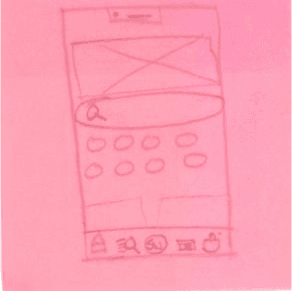
We started the ideation phase by sketching low-fidelity wireframes on post-it notes. This allowed us to quickly experiment with layout, navigation, and content hierarchy without getting bogged down in graphic details. These rapid, rough sketches served as a shared starting point to test and adapt our ideas early in the design process.


Structuring the Journey with Scenarios
To ensure these wireframes actively solved our user's pain points, we applied sequential storyboarding a completely new UX method for me that proved incredibly valuable. Drawing on large A3 paper gave us the freedom to brainstorm without digital restrictions, breaking the user journey into four distinct scenarios:
Problem Scenario
Activity Scenario
Information Scenario
Interaction Scenario
Problem Scenario
Visualizing Carla’s current frustrations with the existing app, specifically the confusing navigation, generic content, and her inability to locate saved products in the physical warehouse.


Hi-Fi wireframes
To bridge the gap between our rough post-it sketches and the final UI, we developed high-fidelity wireframes in Figma. We kept these as simple black-and-white layouts with placeholders for images and text. Stripping away the visual design allowed us to quickly test and adjust user flows and navigation structures without getting distracted by aesthetics.

Frontpage

Product page

Category

Shopping list
Validation & Usability Testing of new concept
To measure whether our redesign successfully solved the navigation and personalization friction points, we conducted controlled lab usability tests with three participants from our target demographic, utilizing the think-aloud method and evaluating against Nielsen’s usability heuristics.
Key Observations
INSIGHT 1
Efficiency
Participants could instantly view exact physical warehouse locations (shelf and rack numbers) directly inside the shopping cart. This completely eliminated the need to click back into individual product pages, drastically streamlining the physical store experience.
INSIGHT 2
Satisfaction
Users heavily praised the new personalization onboarding. By actively selecting their interior style and budget, participants felt the resulting inspiration feed was genuinely relevant and tailored to their needs.
INSIGHT 3
Learnability
The shift to a clean, image-driven layout allowed users to navigate effortlessly, instantly recognizing core icons without a frustrating learning curve.
Key takeaway
Testing proved that our structural changes successfully bridged the gap between the digital app and the physical warehouse. However, it also revealed a minor usability flaw regarding package quantities, users misinterpreted labels like "2x Reol" as meaning two separate shelves rather than one shelf delivered in two packages. This provided an invaluable, actionable insight for future error-prevention microcopy iterations.
Final Solution
After refining the design based on usability testing and iterating on the interface, the final IKEA app redesign was complete and ready to present to the team.

Learnings
My main learning was the critical importance of bridging digital interfaces with physical service ecosystems through tools like Product-Service-System (PSS) mapping, ensuring the app genuinely supports the in-store experience.
And how to translate qualitative insights and scenario-based design into concrete, user-centered navigation choices instead of relying on assumptions.
Working through the entire process—from baseline testing to final validation—turned out to be very educational for me. From that, I learned:
Structuring complexity creates clarity: Using methods like sequential storyboards and activity scenarios is invaluable for turning scattered user frustrations into clear design challenges that actively drive the prototyping.
While our prototype testing yielded deep qualitative insights, relying on a single test user for the initial legacy app evaluation highlighted the operational need for a broader baseline sample to fully capture diverse behaviors.
Solving a user’s functional do-goals is only half the battle; addressing their be-goals—such as feeling in control, inspired, and understood—is what transforms a standard tool into a meaningful experience.
I’m looking forward to using the experience from what I’ve learned here in my future projects. 😊